
Mastering Mobile Photography: Techniques for Professional-Level Phone Shots

Mastering Mobile Photography: Techniques for Professional-Level Phone Shots
Quick Links
- Literal Framing of Your Scenes
- The Rule of Thirds
- When Symmetry Is The Better Choice
- Using Layers to Add Depth
- Getting Creative With Angles
- Near & Far: Mixing It Up
There’s a saying in the photography world that the best camera for the job is the one you have with you at the time. For most of us, the one camera we can guarantee to have with us wherever we may be is the one built right into our smartphone.
These indeed have small sensors and cheap lenses compared to even a relatively modest standalone camera, but it’s also true that they can deliver remarkable results in the right hands.
By applying some classic photographic techniques, it’s easier than you might think to elevate your smartphone shooting from snapshots to beautiful photographs. In doing so, you demonstrate the truth of another photography adage: it’s all about the photographer, not the camera.
Literal Framing of Your Scenes
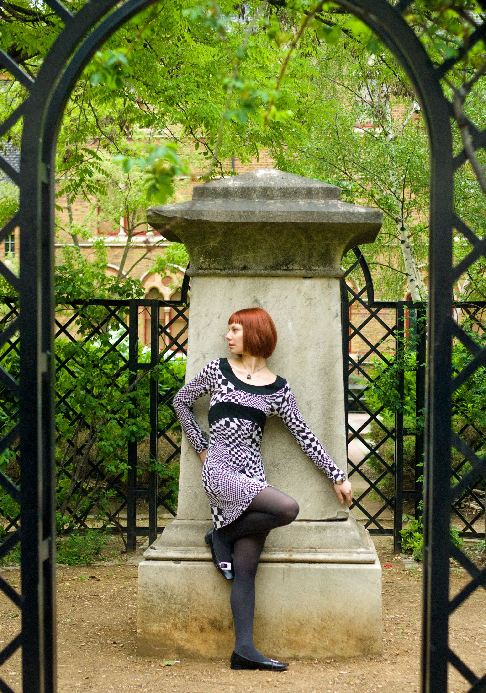
Framing a scene is the term given to deciding on the composition. What you include in the photo, and what you don’t. But one technique that can often work well is to look for opportunities to literally frame your scene. That is, find something in the scene to shoot through, like an arch, and include that in the scene. This can be a really effective way to add depth to a scene.
Ben Lovejoy / How-To Geek
With this photo, I was shooting in a tiny garden in central London. Simply standing back a little further than the obvious framing enabled me to include a lattice arch and use that to frame the shot.
Ben Lovejoy / How-To Geek
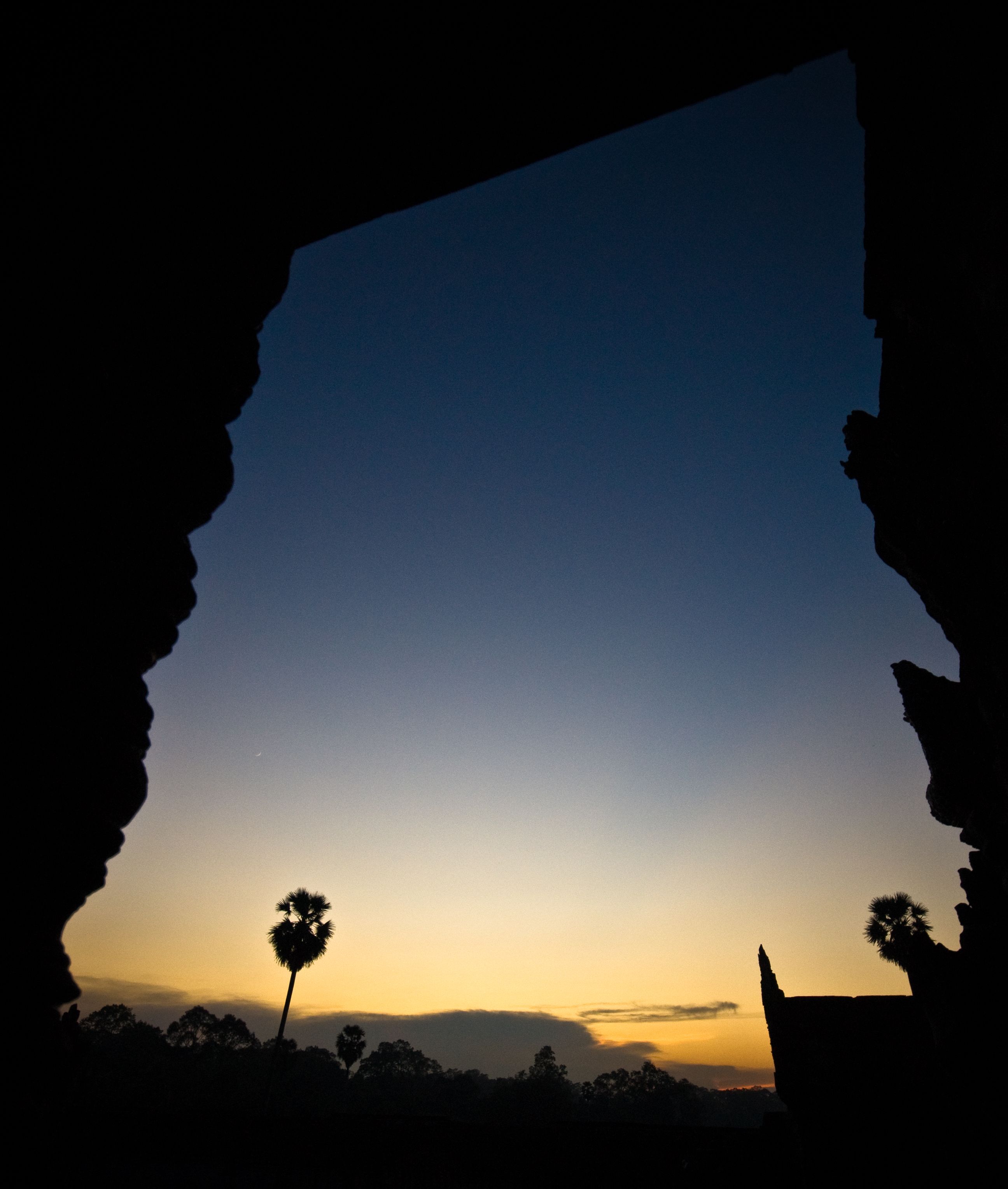
This was a sunrise shot in an ancient temple in Cambodia, with some stone window frames. Again, just standing back far enough to include the wall lent depth and interest to the scene.

Ben Lovejoy / How-To Geek
This one was in Havana, and I positioned myself in front of a hotel. That allowed me to borrow the arch, canopy, and a lamp, all of which nicely framed the busy street scene. Any time you’re wandering around a city, look out for archways—you’ll be amazed at how common they are.
Ben Lovejoy / How-To Geek
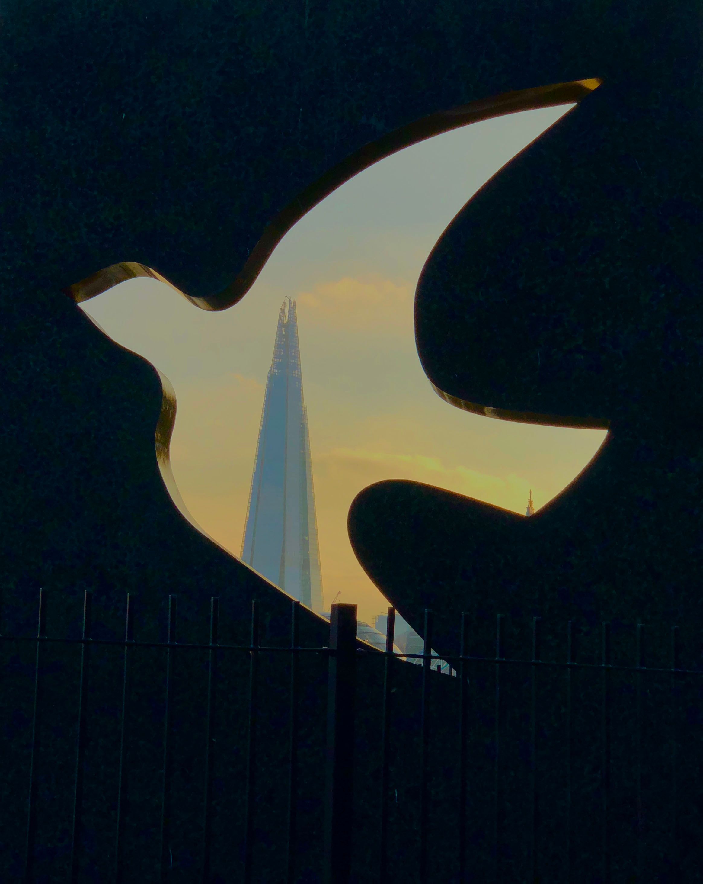
Sculptures can also provide interesting material to include in a scene, but if they contain cutouts, see whether there might be an interesting shot by shooting through one of them. Depending on how high it is off the ground and how accessible it is, your ability to control the angle of the shot might be limited. In this case, for example, the fact that it’s up quite high meant that I couldn’t include quite as many of the lower buildings as I’d have liked, but I think it still works well.
The Rule of Thirds
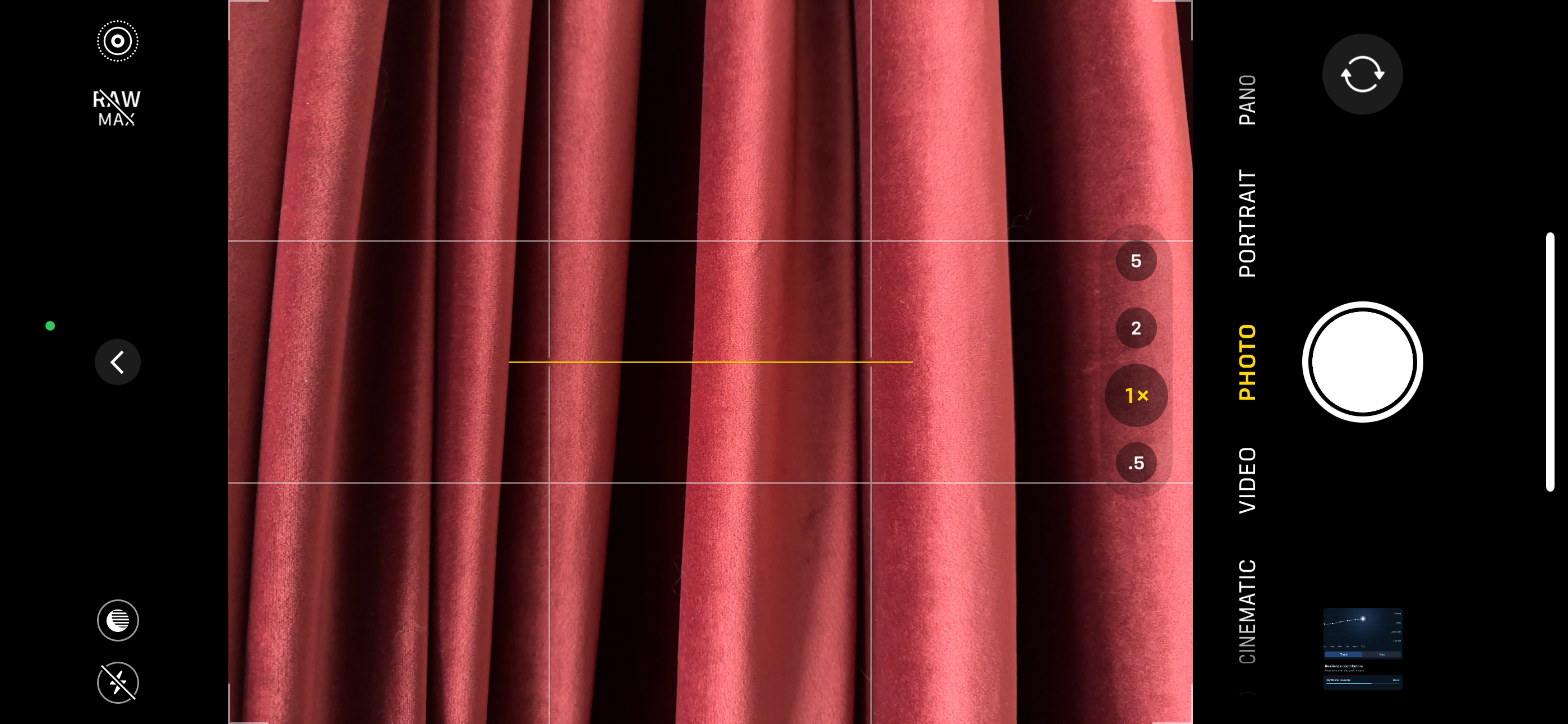
You may have heard of the Rule of Thirds. Personally, I think of it more as the Guideline of Thirds, as it’s certainly not a rule, as we’ll see shortly. But as a guide, it does often work incredibly well, which is why most camera apps offer the option of displaying grid lines to help you use it. I use an iPhone, and you can see it here.
(Screengrab)
The faint white lines are the RoT grid lines, and the yellow line shows you whether you have the horizon level (it’s yellow when you do, white and broken when you don’t). Android camera apps usually have the same. (If you don’t see them, then on iPhone go into the Settings app to toggle it on: Camera > Grid. If you have an Android phone, tap the three dots menu top right in the camera app to enter settings, then select “Grid.”
The idea is that you pick something interesting in your scene and try to position that roughly at one of the intersections of the lines. This means it will be roughly one-third or two-thirds away from the side of the frame and one-third or two-thirds from the bottom. Let’s illustrate this with a few examples.

Ben Lovejoy / How-To Geek
In this example, the subject of the photo is the smiling girl, so I’ve positioned my camera so that she appears roughly at the intersection of the bottom-right grid lines. So, if you have several people in a shot, and you want to draw attention to one of them, try framing such that their face is in one of these intersecting positions. If you’re shooting one person, try positioning their closest eye in one of these positions.
Ben Lovejoy / How-To Geek
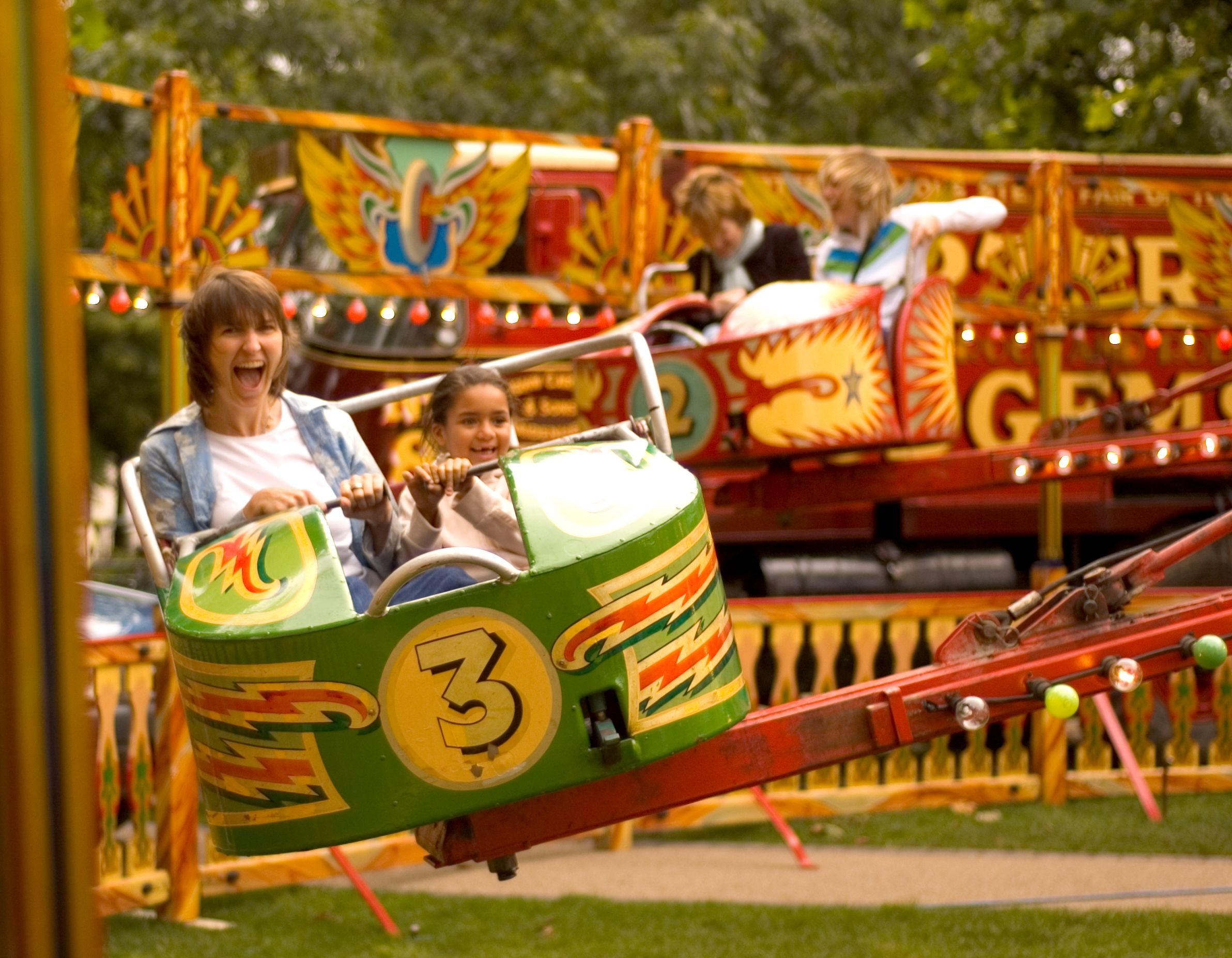
In this next example, the mother and daughter are obviously the subject of the shot, so I’ve framed the shot to place the car containing the pair of them at the bottom left. You might argue that the faces are more vertically centered, and you’d be right. Another way to apply the guideline would be to include more space above them to place their faces at the intersection.
Ben Lovejoy / How-To Geek
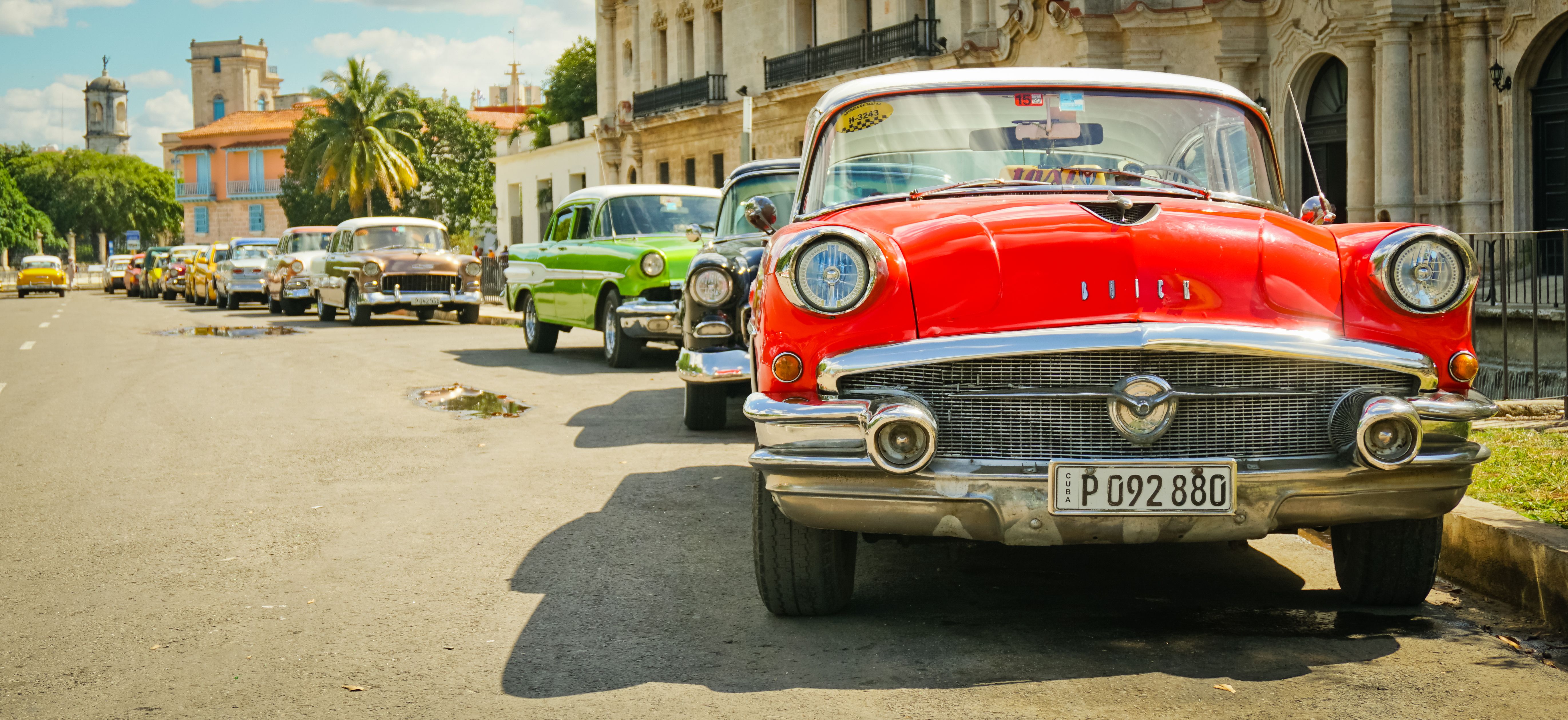
Here, I want the viewer to begin looking at the grille of the car and then follow the line of cars back. (That’s another technique that can be useful to play with, known as leading lines.) So here, the grille is bottom-right.
Ben Lovejoy / How-To Geek
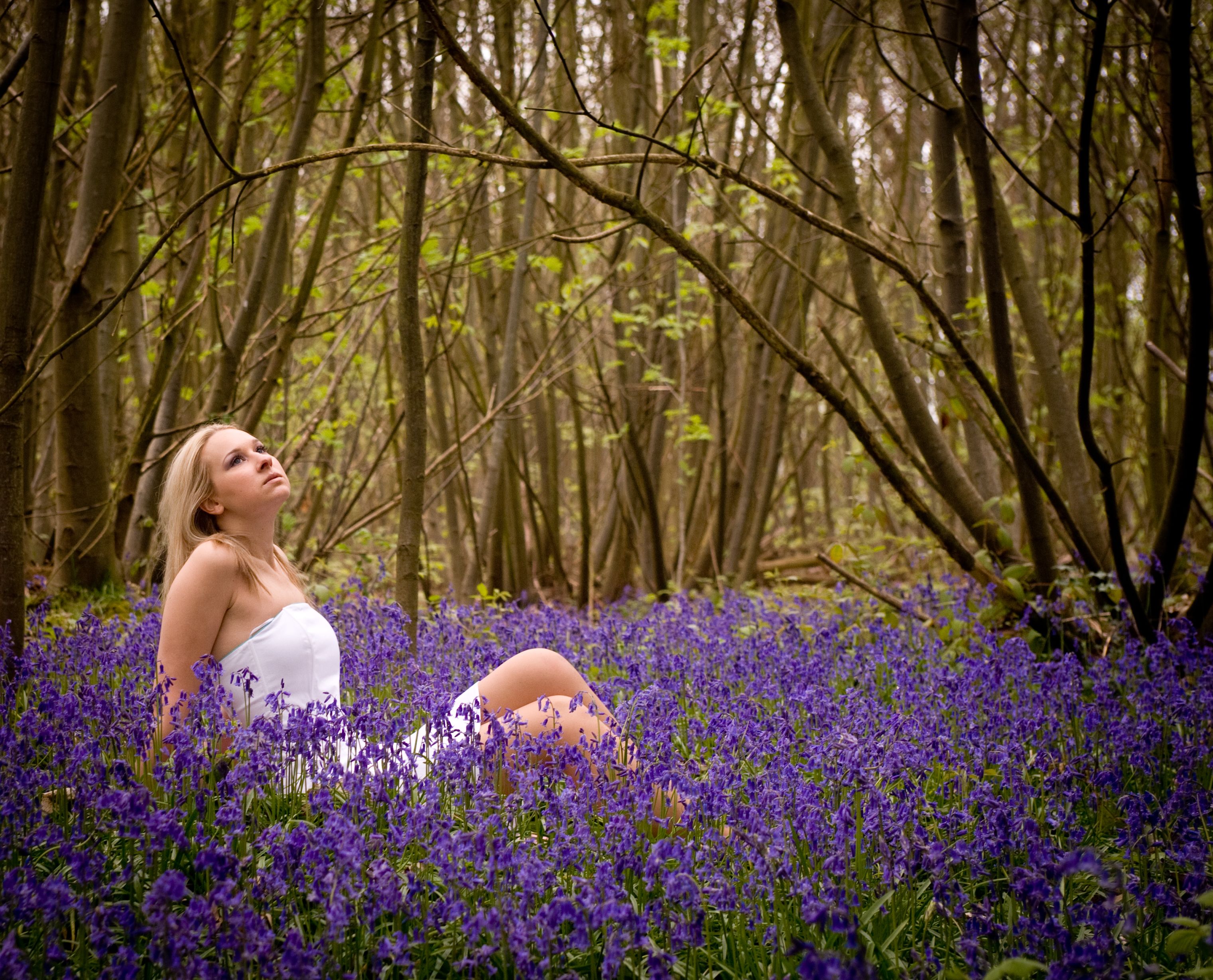
In this final example, the woman is, of course, the subject of the shot, and I’ve positioned her roughly bottom-left. Again, mathematicians might object that her face is more like a sixth of the way from the left, but that’s why I refer to it as a guide rather than a rule.
Ultimately, the Rule of Thirds is not intended to turn you into a robot, mechanically using exact placements, but rather to cure the common tendency of beginner photographers to position everything in the center of the frame. Use it as a guideline, but use your own judgment as to what looks best.
When Symmetry Is The Better Choice
But what about those times when you want the subject of your photo to be centered? No problem—go right ahead. You’re the photographer, and sometimes the Rule of Thirds just isn’t the best option.
Ben Lovejoy / How-To Geek
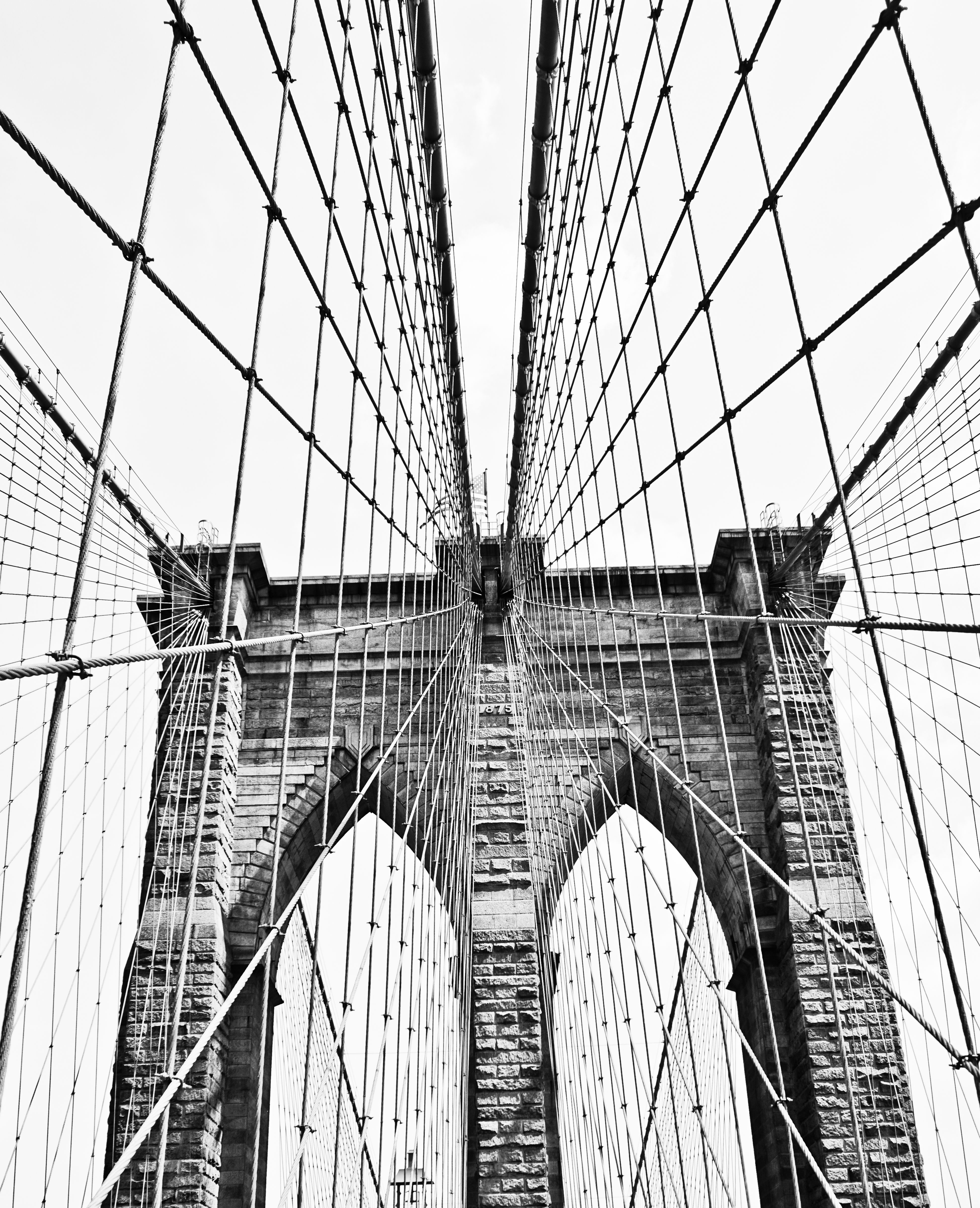
A good example is when you want to draw attention to symmetry. When I was standing in the center of the Brooklyn Bridge, for example, it struck me that I could literally be looking at a mirror image, so I chose a completely symmetrical framing for the shot.
Ben Lovejoy / How-To Geek
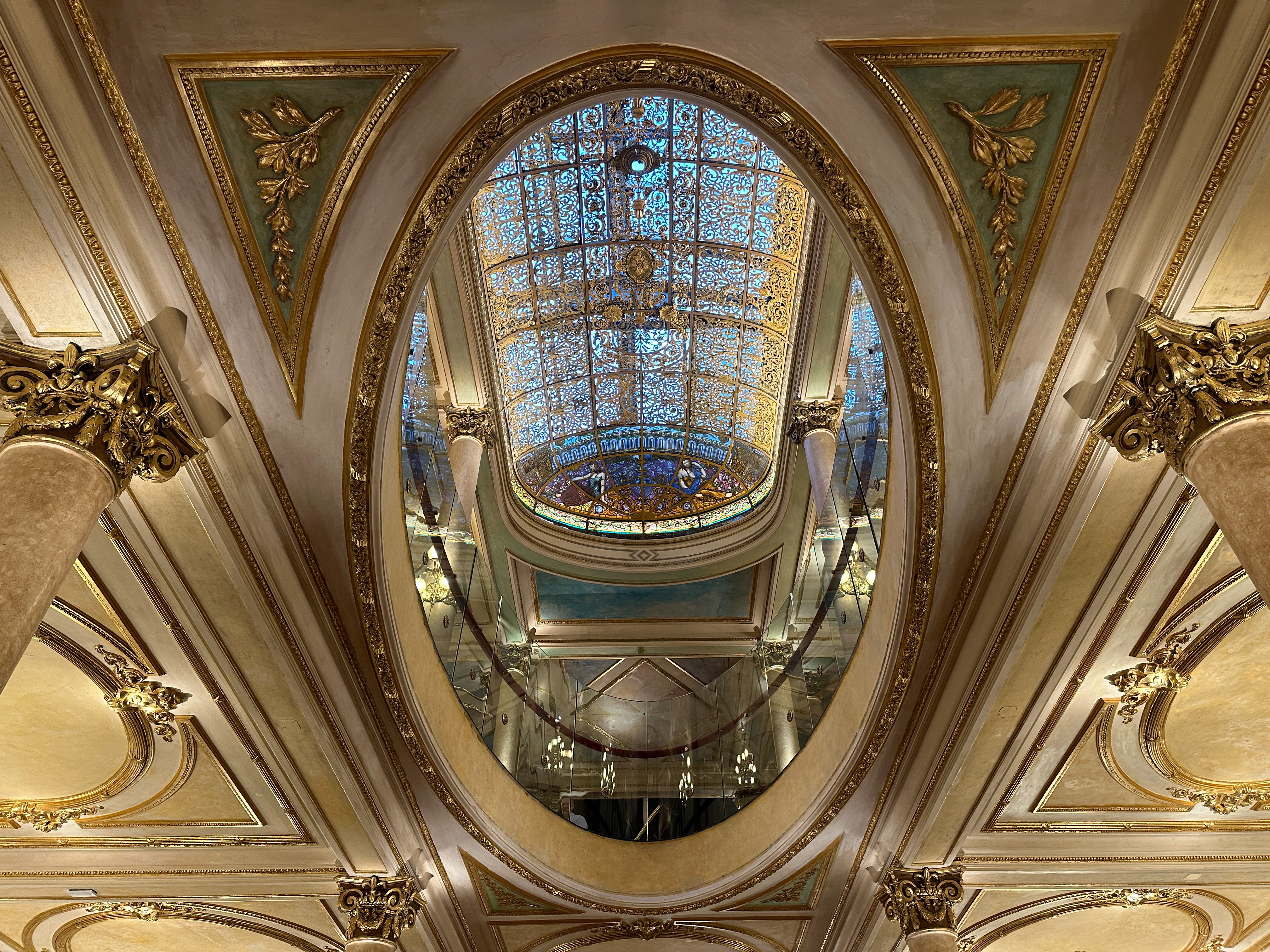
There will be times when symmetrical framing just looks right. I often find that’s the case with beautiful architectural details, for example. In this case, in a grand cafe in Buenos Aires, it seemed clear to me that the architect intended the design to be enjoyed from a central vantage point, so that’s how I shot it.

Ben Lovejoy / How-To Geek
Don’t assume that a scene has to be perfectly symmetrical for central placement to be the best choice. I still opted to centrally frame this gorgeous art deco Post Office in Miami, even though the building itself is not symmetrical. To me, the round central component is the focus here, and that part is symmetrical. Again, use your judgment, and experiment, to see what you think looks best.
Using Layers to Add Depth
Photographs turn a three-dimensional scene into a two-dimensional image (though things like Spatial Photos on Vision Pro may be changing that!). But we can often capture some of that 3D feel by using layering in our photos.
What do I mean by this? A layered photo might have something in the foreground (close to us), something in the midground (middle distance), and something in the background (most distant point). Other times, we might only think in terms of foreground and background—it’s generally having a foreground element that creates that feeling of depth. Again, let’s look at some examples.
Ben Lovejoy / How-To Geek
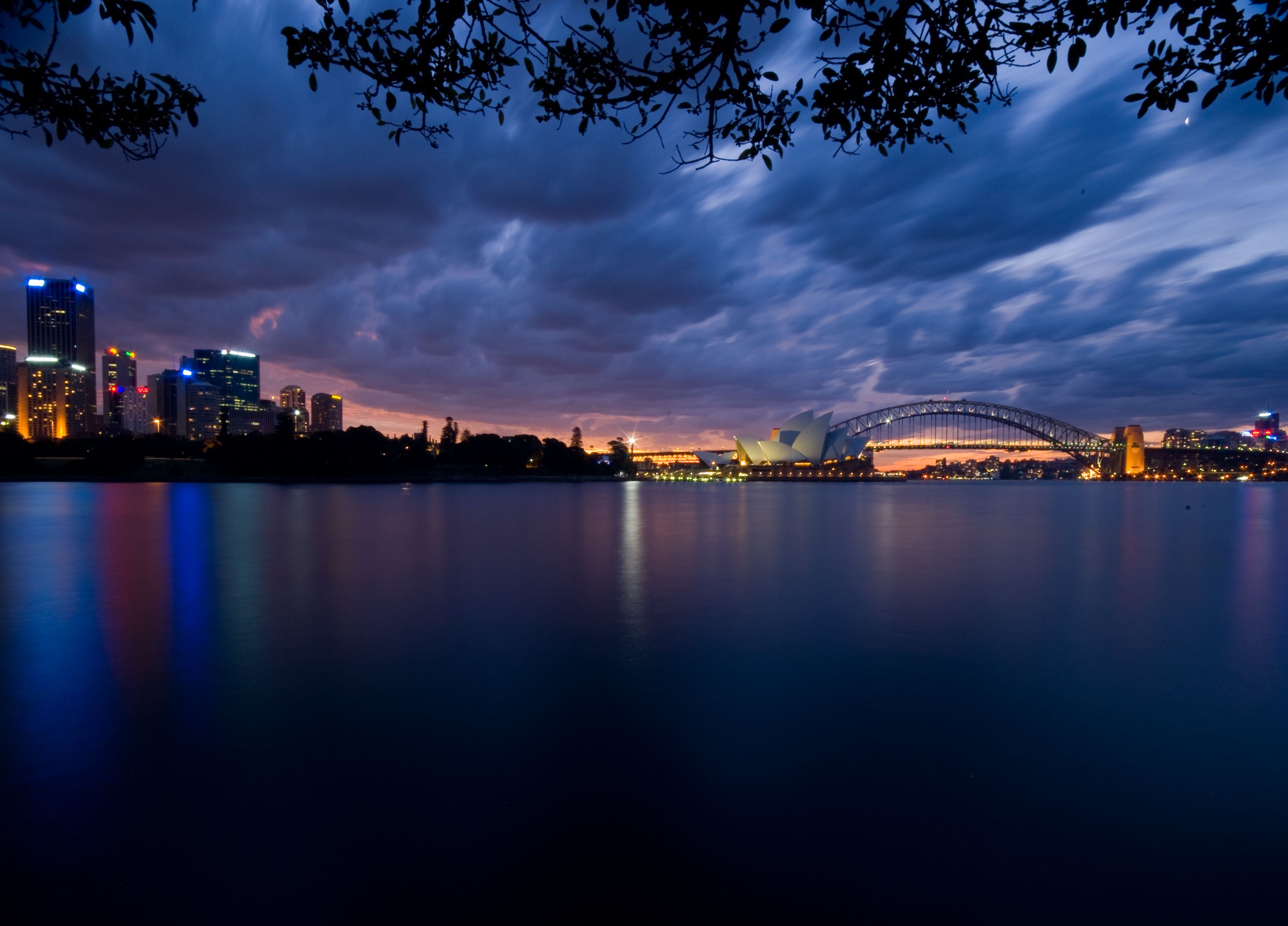
This photo of Sydney Harbour was shot from across the water near a bench known as Mrs Macquarie’s Chair. I was standing under the trees, and I took a wide-angle photo to include the tree branches above me. That serves as a partial literal frame, as described above, but also lends a sense of scale. If you use your hand to block the trees when looking at the photo, I think you’ll agree it becomes less aesthetically pleasing.
Ben Lovejoy / How-To Geek
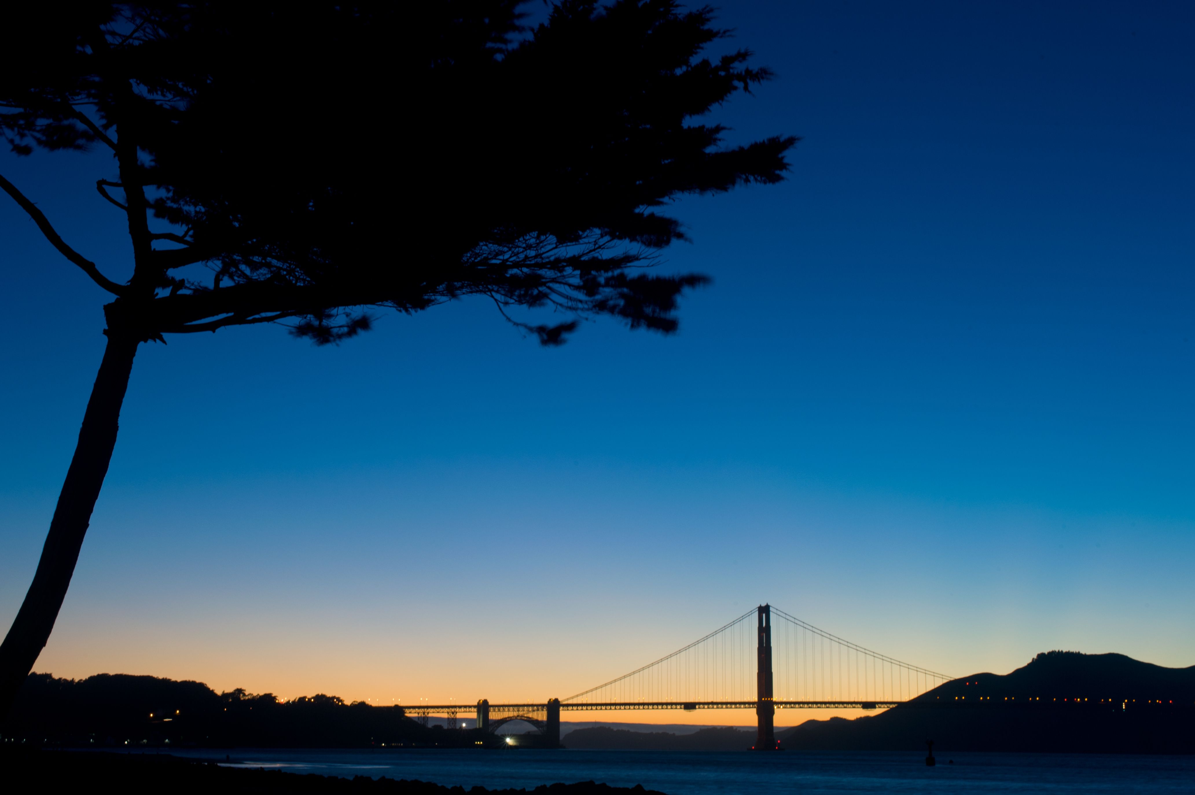
This shot of the Golden Gate Bridge is taken at quite a distance, and I’ve positioned myself such that I include a tree in the foreground. To me, this makes for a more visually balanced and interesting shot.
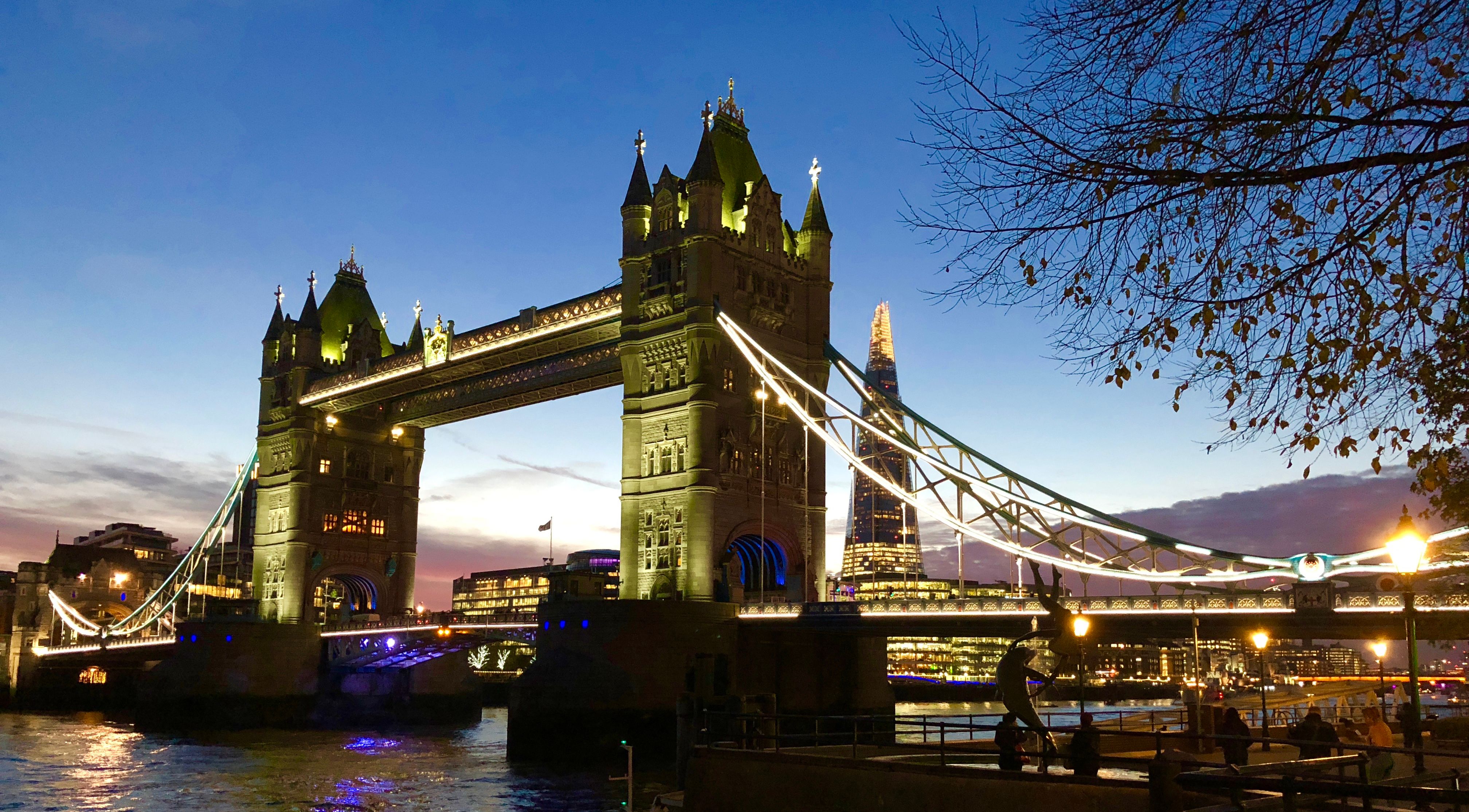
So, it seems I rather frequently use trees for foreground content! This shot of London’s Tower Bridge similarly includes the tree on the right, partly to add depth to the shot but also to make for a more pleasing composition, the rounded shape mirroring the curve of the bridge supports.
Getting Creative With Angles
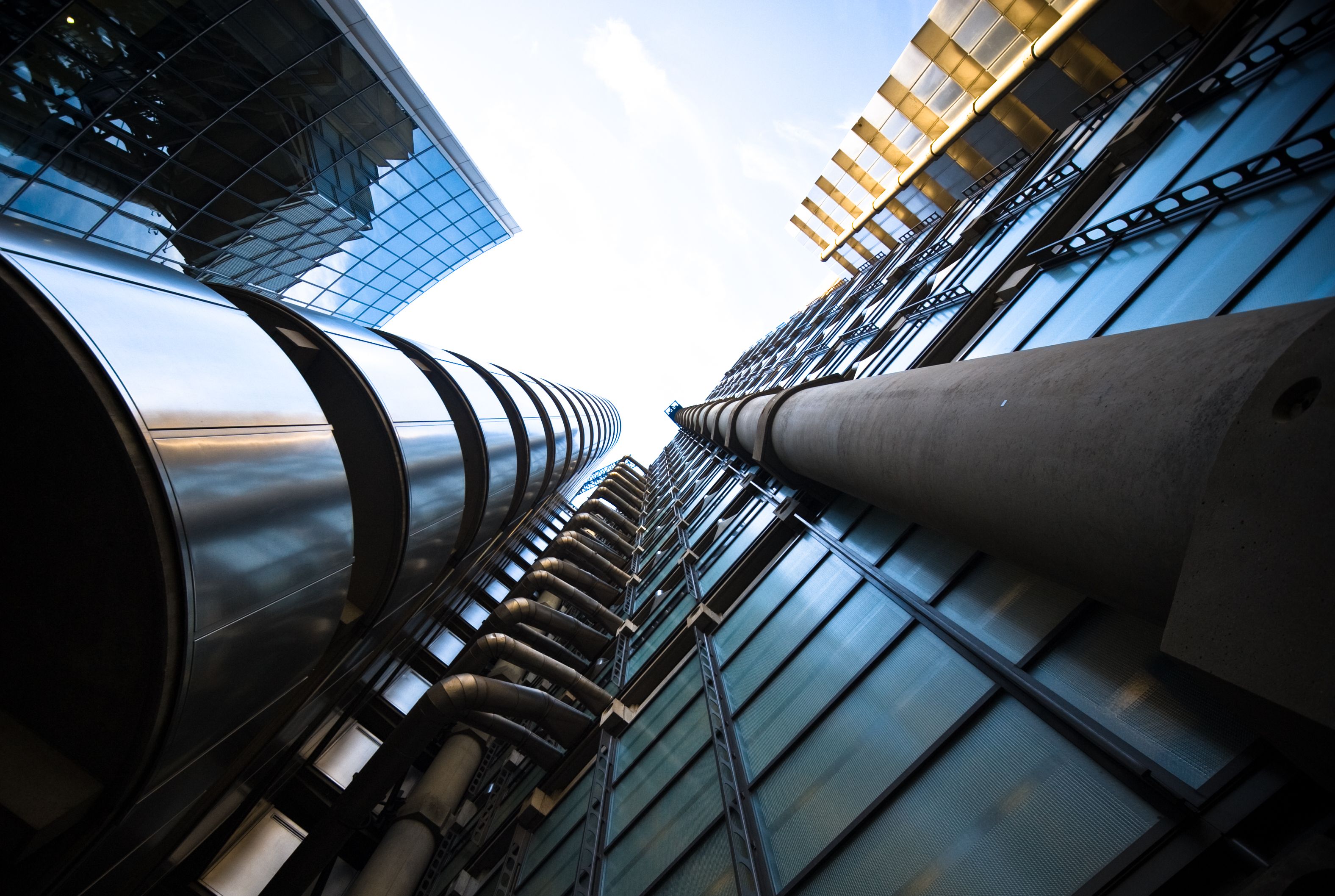
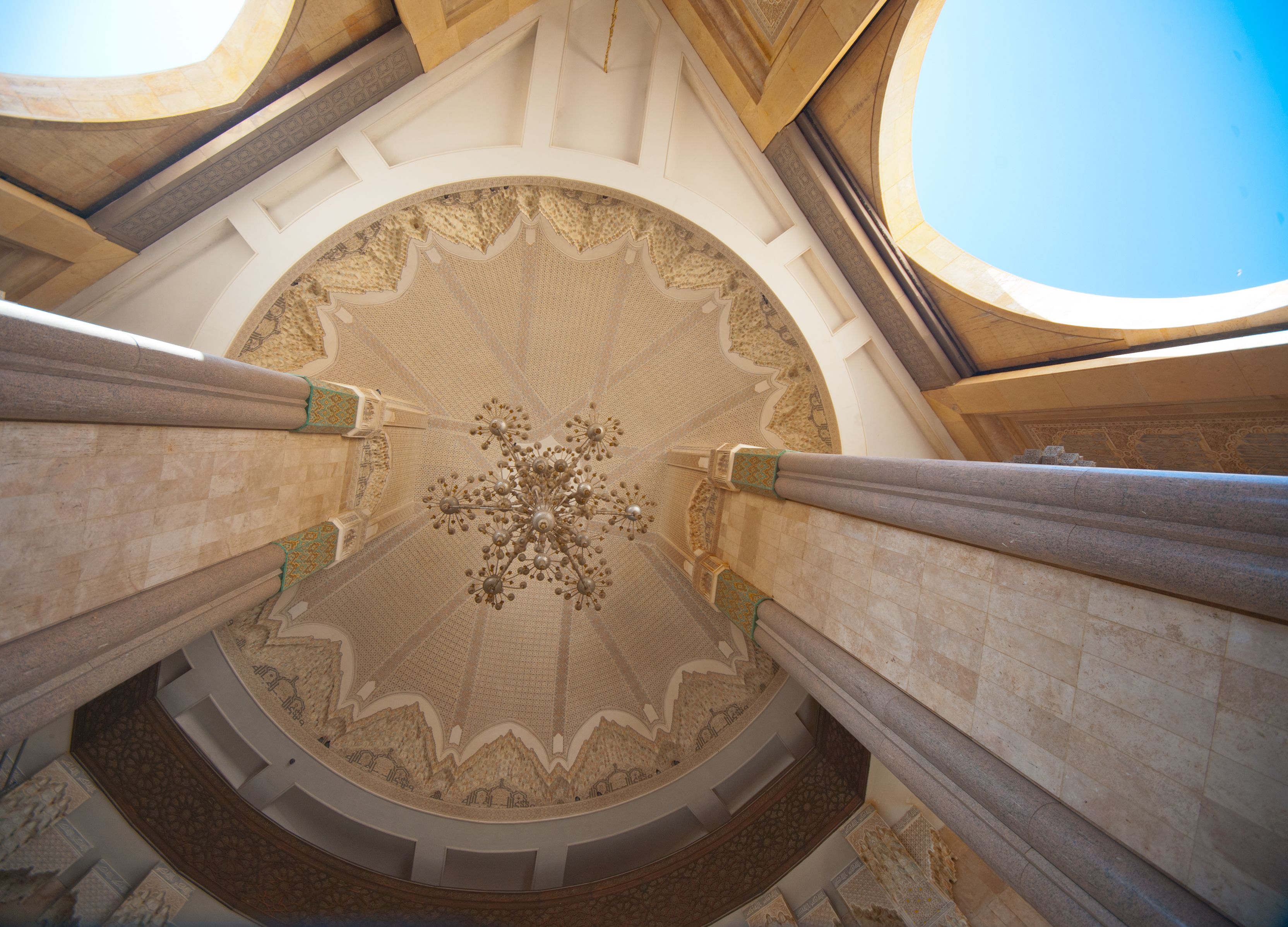
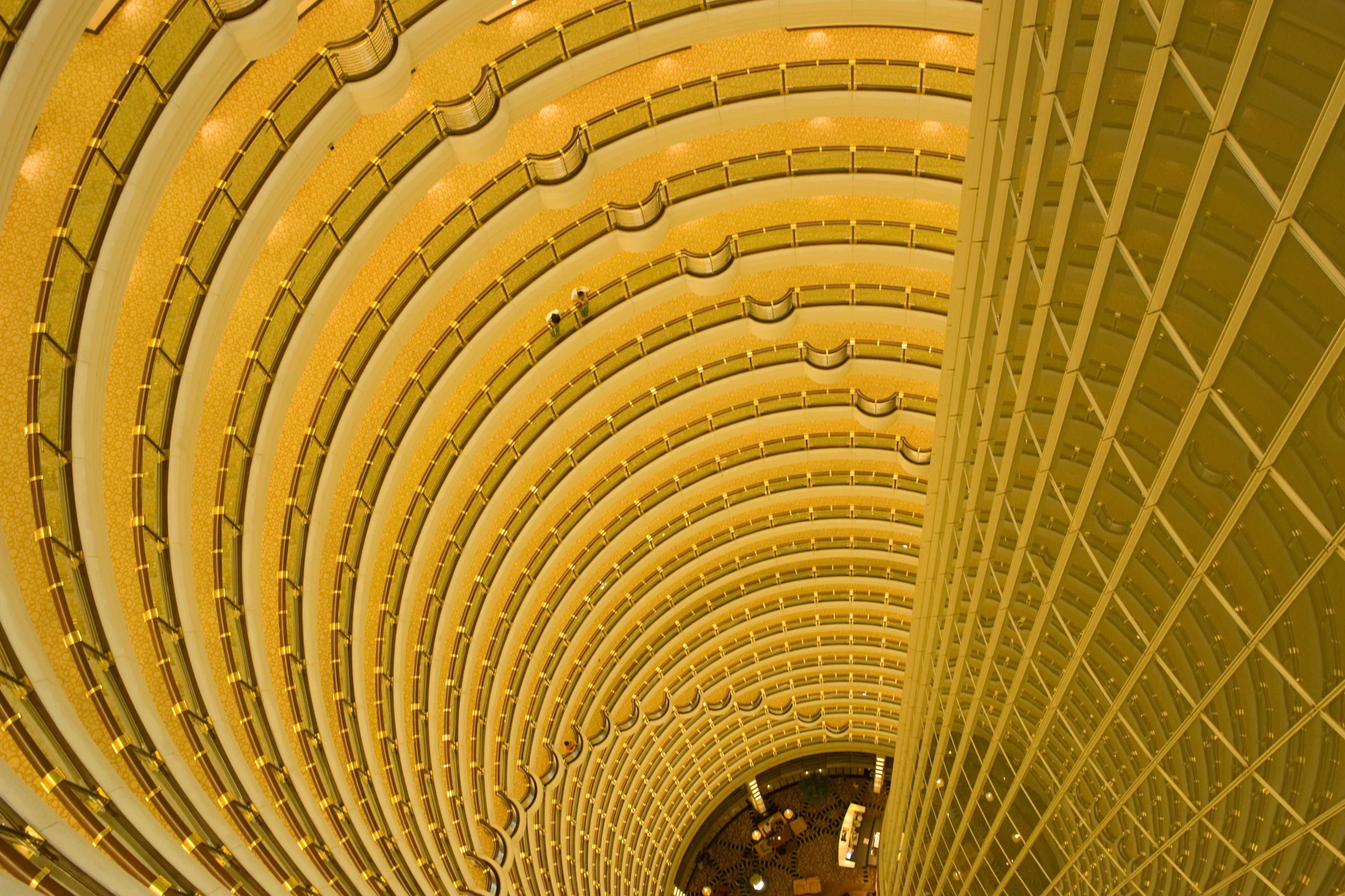
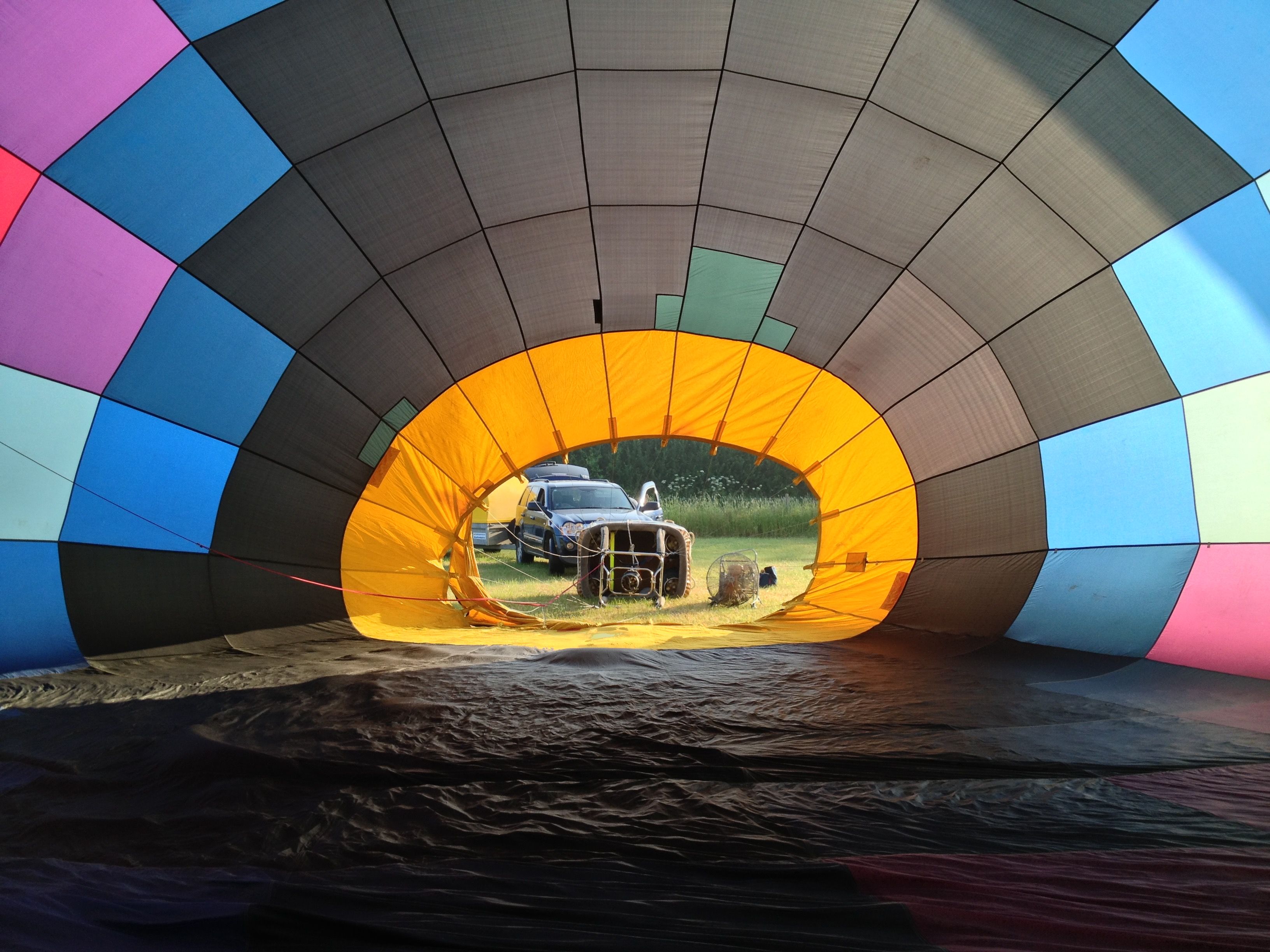
The natural tendency of beginner photographers is to shoot everything square-on, from eye level. Try instead crouching down low, finding a way to get up high, or some other unusual angle. Again, a few examples.
Ben Lovejoy / How-To Geek
In this case, I’ve gotten down low and shot directly upwards to create a more interesting view of the Lloyds of London building that we would have got from a more conventional angle.
Ben Lovejoy / How-To Geek
Similarly, for this shot of a mosque in Casablanca, I’ve walked into one of the arches, put the camera on the ground so it’s shooting straight up, and then used the self-timer to step back so I’m not in the shot.
Ben Lovejoy / How-To Geek
For a shot of this spectacular hotel atrium in Shanghai, I’ve taken the opposite approach. While it looked good shooting up from the lobby, I found that taking the elevator to the top floor and shooting down gave an even better view. I’ve also chosen a tight shot to fill the frame with nothing but the atrium.
Ben Lovejoy / How-To Geek
Finally, think laterally! It’s hard to take a bad shot of a hot-air balloon, but since I was learning to fly them at the time, I had the opportunity to find an unusual angle.
Near & Far: Mixing It Up
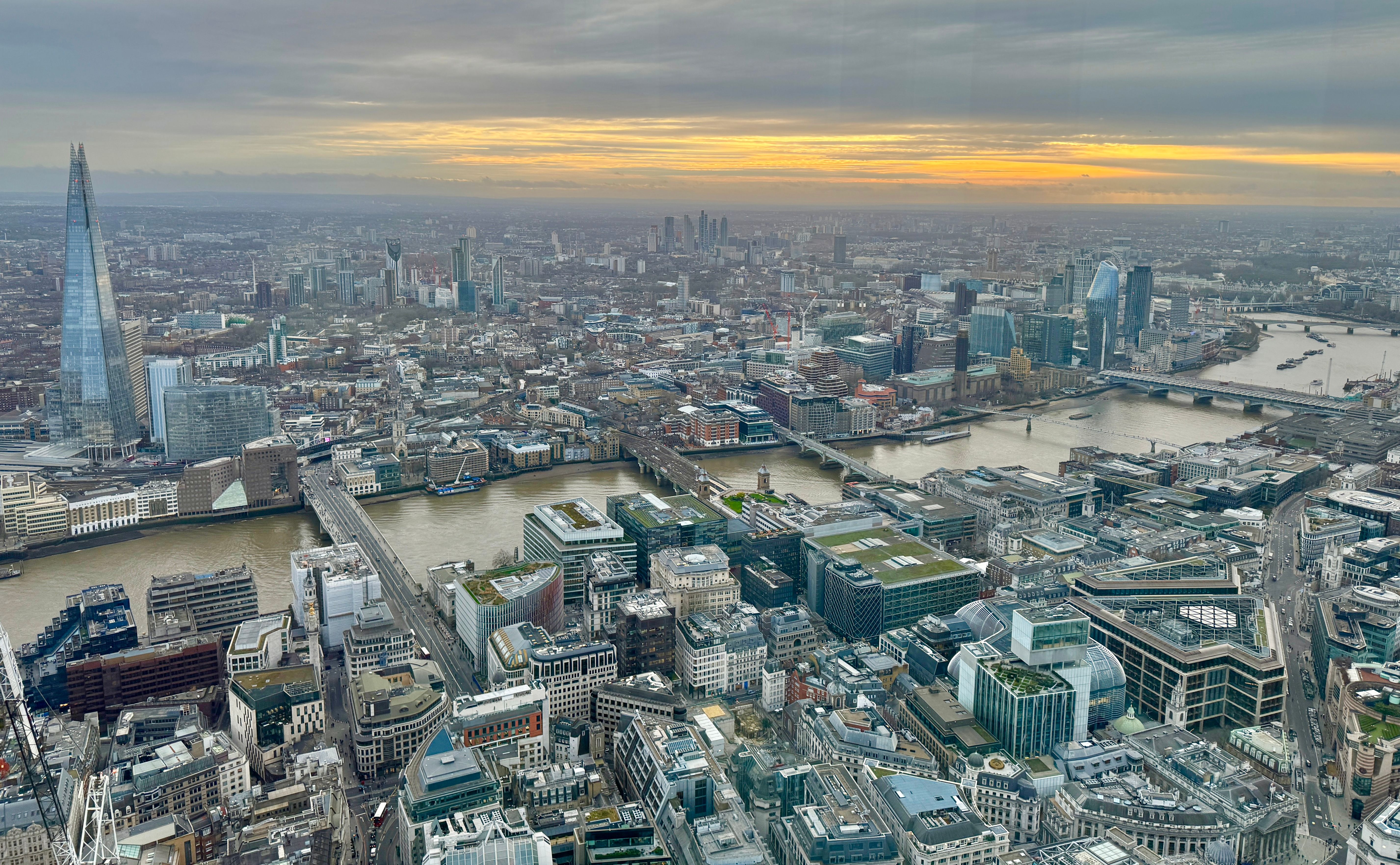
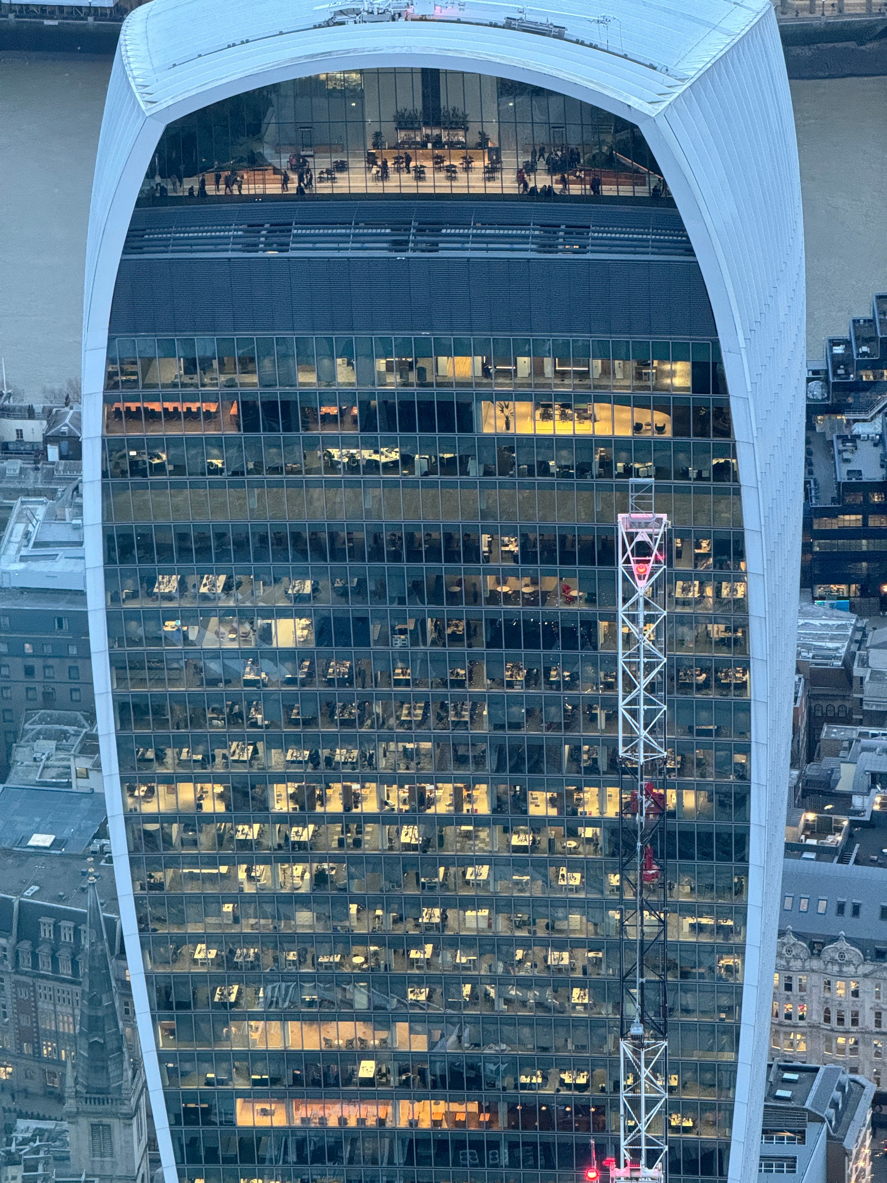
Most premium smartphones these days include both wide-angle and telephoto lenses, so rather than stick to the standard lens all the time, try experimenting with these. The great thing about that kind of flexibility is that you can get very different-looking shots from the same place. For example, I visited a viewing deck in the City of London, and here are two photos taken from the same position:
Ben Lovejoy / How-To Geek
First, we have a wide-angle shot, which shows a good chunk of the city.
Ben Lovejoy / How-To Geek
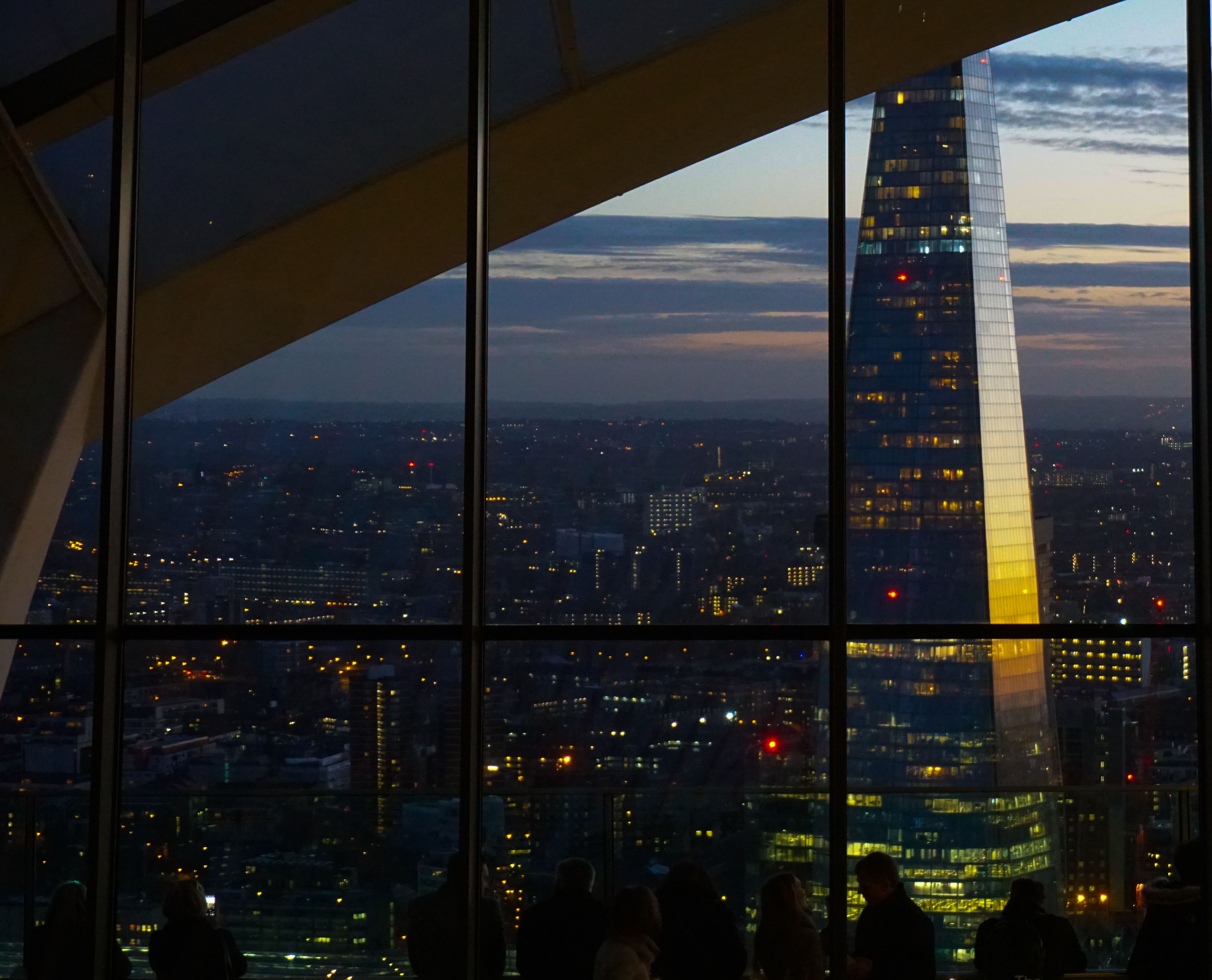
But simply turning a little to my left and selecting the 5x telephoto lens on my iPhone gave me this close-up of the back of the Walkie-Talkie: same time, same place, but a completely different shot.
Ben Lovejoy / How-To Geek
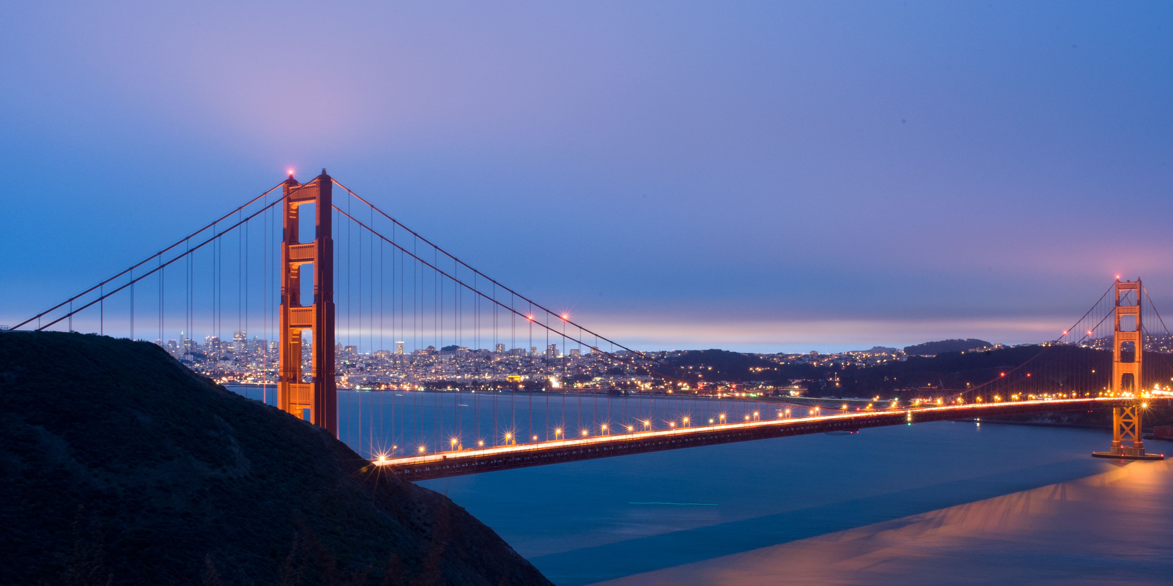
Back to San Francisco, and this is a classic view of the bridge from the viewing point on the Marin Headlands.
Ben Lovejoy / How-To Geek
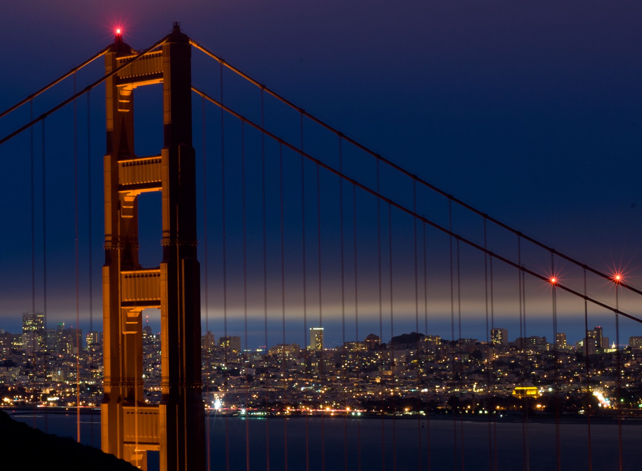
But zoom in, and we get a very different shot, again from the same place at the same time. It was this shot I ended up hanging on my wall.
Ben Lovejoy / How-To Geek
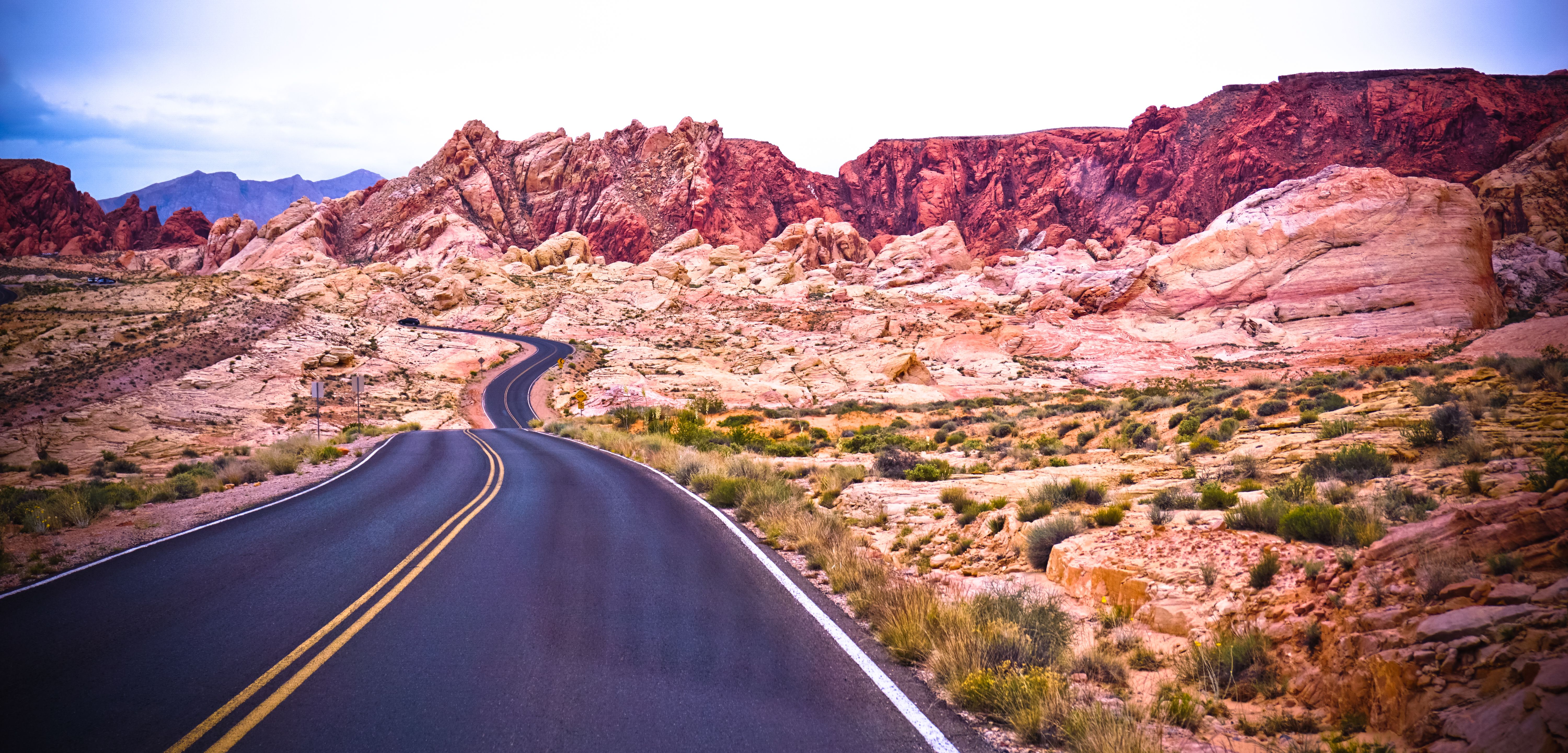
A day trip from Vegas to the Valley of Fire let me get this wide shot, which looks like something out of a car commercial.

Ben Lovejoy / How-To Geek
A very close and tight shot of one of the nearby rock formations gave me a very abstract-looking shot that couldn’t be more different.
Ben Lovejoy / How-To Geek
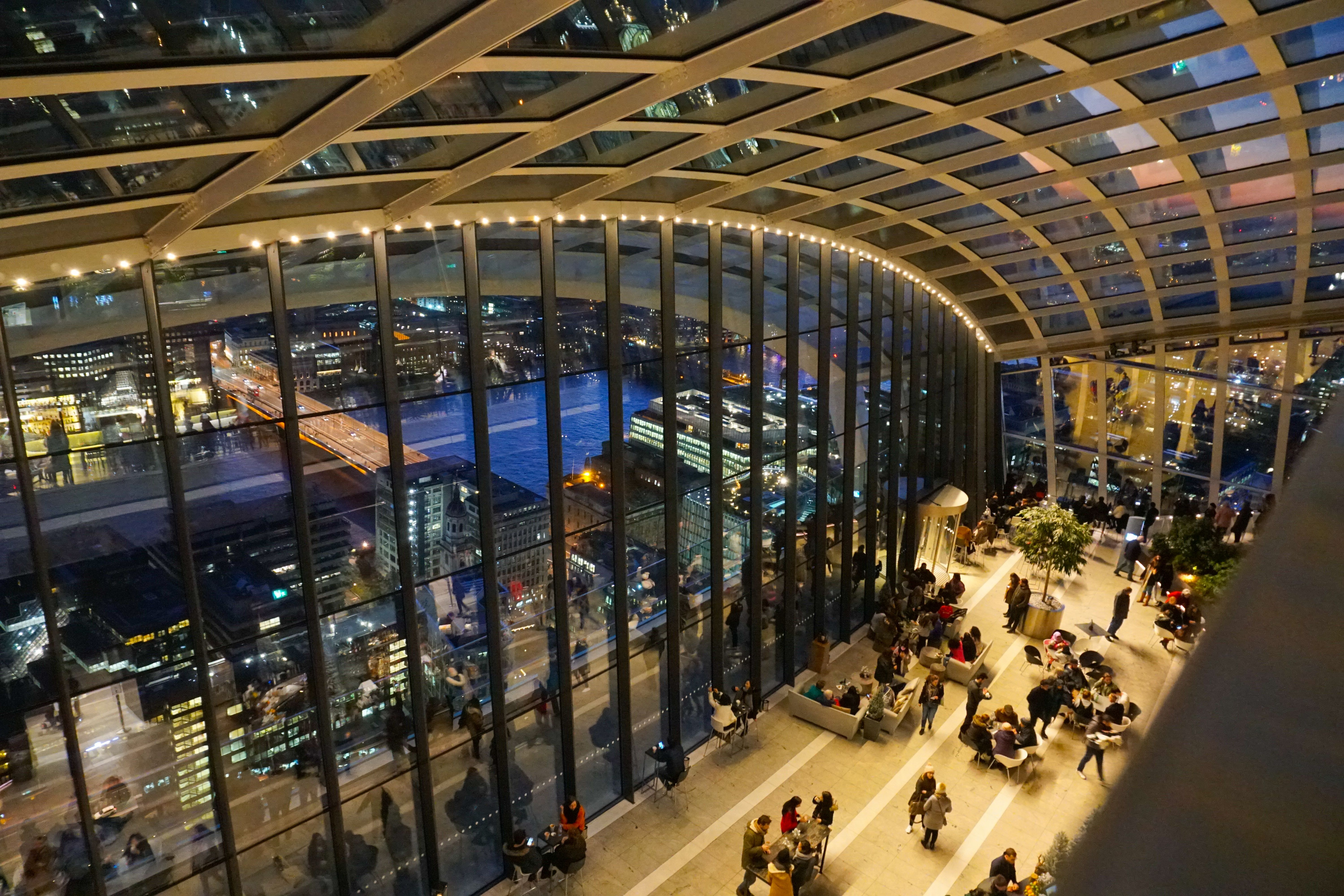
Finally, don’t think that wide shots are only good for wide open landscapes or cityscapes. We just saw a telephoto shot of the Walkie-Talkie building, and now here’s a wide-angle shot of the spectacular interior.
Ben Lovejoy / How-To Geek
Here’s a telephoto shot taken from inside that same space (albeit from floor level rather than the top of the stairs).
I’m old, so my first camera was a film one. I had to buy the film, the developing chemicals, and the photographic paper. Every single shot cost me money and took me time and effort to print in the darkroom, so it got me into the habit of looking and thinking first and shooting second.
The great thing about digital cameras, including our smartphones, is that it costs nothing to experiment. But my invitation to you would be to enjoy the best of both worlds. Shoot a lot, and find out what works for you, but also shoot with intention. Look and think first, decide what it is you want to convey through your shot and use the techniques I’ve outlined to help you take a photograph you’ll look back at with pride and pleasure.
Also read:
- [New] In 2024, How to Illuminate A Guide to Great Vlog Images
- [New] The Synergy in Hybrid Realms Mixed Reality Explained
- [Updated] Bring Back Sharpness The Ultimate Choice for Restoring Images
- Demystifying Apple Watch Face Exchange - Effortless Tutorial Revealed by ZDNet
- In 2024, The 6 Best SIM Unlock Services That Actually Work On Your Xiaomi 14 Device
- Mirthful Methodology Making Memes for Free
- Step-by-Step to Enable Google's Pixel Watch Fall Detection and Understanding Its Importance
- The Ultimate Pre-Buy Guide for Smart Televisions: Discover These Absolutely Critical Elements First!
- Top Kid-Friendly Smartwatches That Aren't Apple or Garmin: In-Depth Reviews & Comparisons
- Unboxing & Testing Report: The Premium $649 Samsung Galaxy Watch Ultra and What It Really Offers – An Exclusive Insight by a Gadget Enthusiast | ZDNet
- Unveiling ZDNet's Methodology for Assessing Top-Tier Smartwatches on the Market
- Title: Mastering Mobile Photography: Techniques for Professional-Level Phone Shots
- Author: George
- Created at : 2025-01-02 10:03:04
- Updated at : 2025-01-05 19:49:20
- Link: https://hardware-tips.techidaily.com/mastering-mobile-photography-techniques-for-professional-level-phone-shots/
- License: This work is licensed under CC BY-NC-SA 4.0.